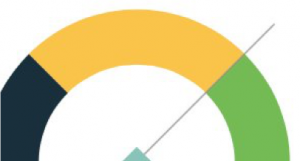
Gauges

Gauges are one of many types of data visualizations used to organize and present data in a way the audience can understand and take action on. To ensure visualizations have real business value, it’s important to know which types of visualizations are best suited for a given data set.
While some users still prefer gauges, these attention-grabbing visualizations are notorious for taking up valuable space and providing limited information, since they present data on a single dimension. All they really tell you is whether something is on target, above target, or below target.
So what are the other alternatives to gauges? Line charts show trends over time; bar charts are great for comparisons; bullet charts are good for targets; and if preferred, you can opt for a mishmash of several types of combinations.