How to Build Best-in-Class CFO Dashboards
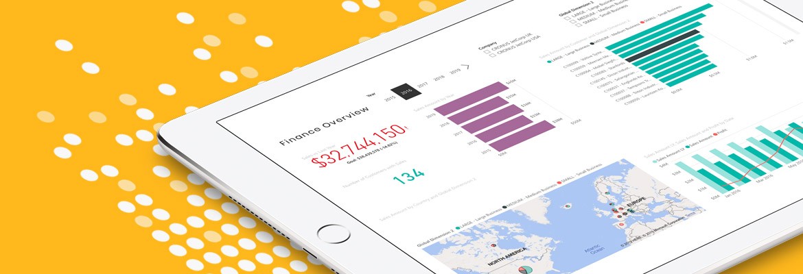
A recent survey conducted by Grant Thornton International offers important insights about the mindset of today’s CFOs. Almost all the respondents (95%) agree that finance must improve its technological expertise, especially in terms of data analytics. Half of the executives even identified analytics as the number one skill they want to cultivate moving forward.
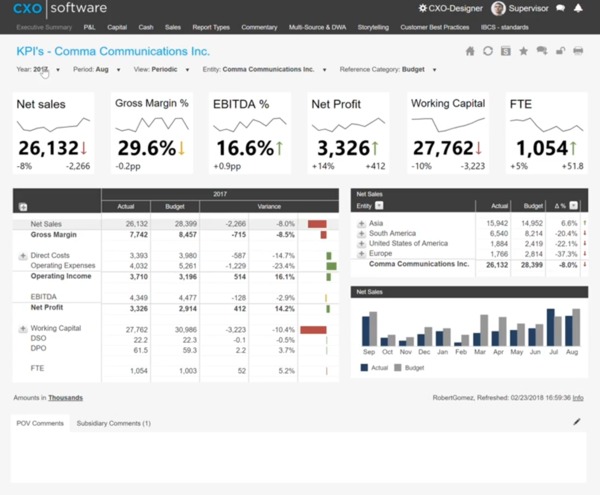
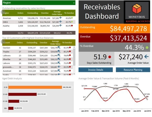
Unfortunately, most CFOs don’t have the time to earn advanced degrees in data science. Instead of trying to become data scientists, CFOs should rely on best-in-class dashboards to make analytics intuitive and accessible. Once implemented, dashboards empower executives to spend less time looking for insights and more time applying them to every important decision.
Download our Operating Cash Flow dashboard and bring your data to life.
As universally beneficial as CFO dashboards may be, however, they are not a one-size-fits-all tool. In practice, dashboards at different companies share some similarities, yet all of them are unique. Follow these best practices for creating your own:
Focus on the Needs of the CFO
CFOs have constantly-changing priorities. Dashboards should reflect those priorities, both in the metrics they include and the design they rely on. The goal is to put important information front and center in a way that makes it immediately digestible. Information should be comprehensive but not overwhelming, which is why many CFOs rely on multiple dashboards, one for sales, another for costs, etc. Dashboards should be flexible as well so they can change with the CFO.
Select the Right KPIs
CFO dashboards deliver insights by grouping together complementary or contrasting metrics. Therefore, the quality of the dashboard depends largely on choosing the right metrics. It’s tempting to include as many metrics as possible, but this can lead to information overload. Instead, choose and group the metrics that speak the loudest about performance. Here are some common choices:
- Working capital
- Operating cash flow
- Current ratio
- Payroll headcount
- Quick ratio
- Debt-to-equity
- Accountants payable
Include Interactivity
Dashboards aren’t supposed to be static objects, and CFOs shouldn’t be passive users either. Best-in-class tools provide a succinct overview of performance updated with real-time information. Just as importantly, those dashboards encourage users to drill into the data to understand the numbers behind the metrics. In that way, dashboards are simply a jumping-off point for CFOs to explore the company’s overall financial performance both broadly and deeply.
Download our Debt to Equity Ratio dashboard for a better way to track performance.
Don’t Neglect Design
Without smart design, there is little difference between a dashboard and a static spreadsheet. Elevating dashboards begins by incorporating visualizations that condense information into charts or graphs. Remember that less is more, so resist the urge to clutter dashboards with visualizations. Many designers follow the inverted pyramid rule, presenting the most important information at the top with supporting information below, but it’s not mandatory. Overall, effective design is about presenting information (and the connections between information) clearly while making the user interface as intuitive as possible.
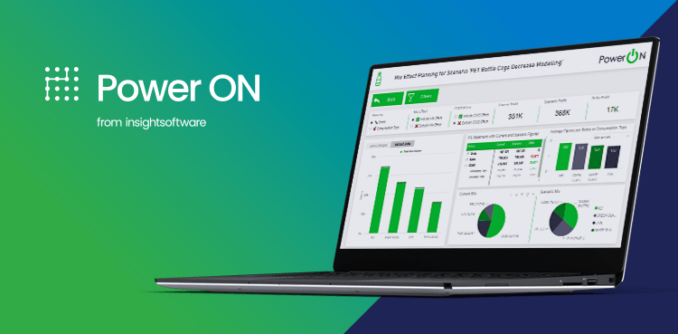
Customizing dashboards should feel like an opportunity to bring new perspectives to finance. Unfortunately, many of the dashboards on the market offer limited flexibility and cumbersome building tools, which is why insightsoftware is different. Our tools are designed for CFOs and for the people who build the dashboards. When you’re ready to see what best-in-class CFO dashboards look like in action, request a free demo.
